Whispered Opulence, Enduring Beauty

Today we explore timeless materials and finishes for an understated luxury interior, celebrating choices that feel calm, confident, and built to last. Expect practical guidance on honed stone, patinated metals, quarter-sawn woods, velvety plasters, and tactile textiles, plus stories and small details that transform daily routines. If you value longevity over fashion, subtle luster over shine, and soulful patina over perfection, you are in the right place. Share your questions and preferences as we go.

Stone That Softly Speaks

Natural stone sets a quiet foundation when its surface is softened and its movement gently controlled. Honed marble, limestone, and travertine bring depth without glare, developing character that tells an honest story over years. The secret lies in subtle veining, thoughtful edges, and appropriate sealing, all balanced with warm woods and aged metal. We will compare finishes, explain real-life maintenance trade-offs, and suggest ways to achieve serenity without sterility. Tell us which stone you trust in busy rooms.

Wood with Quiet Character

Wood supplies warmth and human scale when grain, cut, and finish are chosen thoughtfully. Quarter-sawn oak, walnut, and ash offer dimensional stability and refined figure that resists warping. Oiled or hardwax finishes allow fibers to breathe, deepening tone through handling and light. Gentle fuming or smoking can add smoky depth without artificial stain build-up. Proportion, shadow lines, and hardware placement refine the composition. We will map practical steps to achieve durability, inviting texture, and effortless calm.

Metals That Age Gracefully

Metals frame the experience through handles, lighting, trims, and furniture accents. Unlacquered brass, bronze, and blackened steel each tell a patient story, warming with touch and time. Mixed carefully, they read collected, not chaotic. Finishes from satin to patinated offer varied reflectivity that shapes mood, steering away from mirror-like glare. We will share care tips, palette strategies, and a homeowner anecdote about embracing fingerprints on a new brass faucet—initial worry transformed into affection as it mellowed beautifully.

Living Finishes You Can Trust

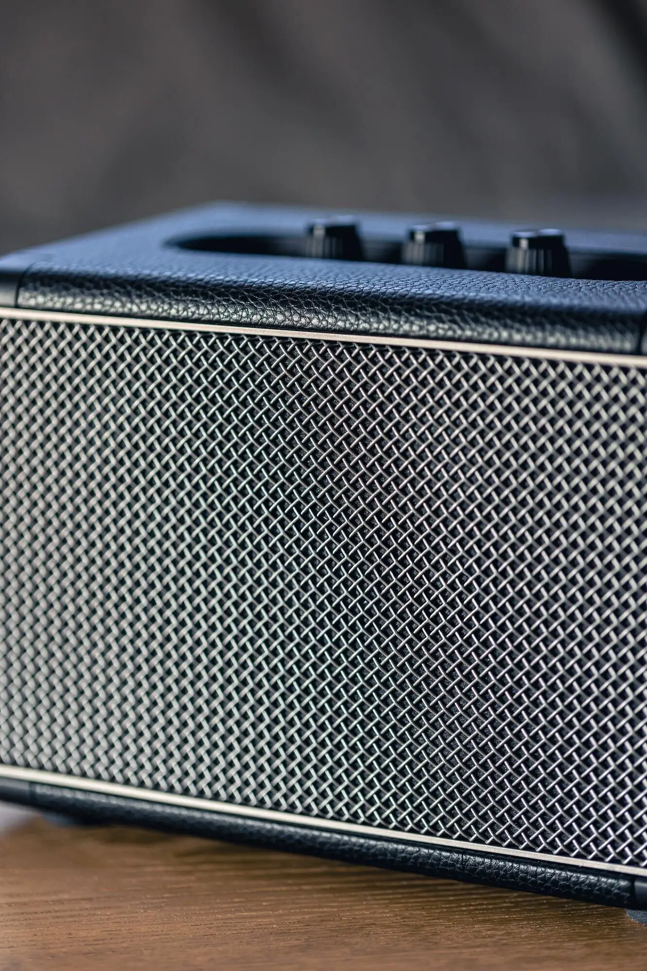
Unlacquered brass and bronze darken and brighten in response to use, humidity, and cleaning habits, developing a personal, lived-in elegance. Accepting this change turns maintenance into appreciation. A light wax can slow patina, while gentle soap preserves character. Avoid harsh polishes that strip depth. Blackened steel, sealed with oil or microcrystalline wax, offers a moody counterpoint to warm woods. These living finishes communicate authenticity, signaling quality through quiet evolution rather than frozen, factory-perfect gloss.

Balanced Mixed-Metal Palettes

Mixing metals works when intent is clear. Choose one primary metal for continuity—perhaps warm brass in hardware—and a secondary accent like bronze or blackened steel in lighting or table bases. Keep sheens compatible to avoid discordant reflections. Repeat each material at least twice within sightlines for cohesion. In cool north light, brass can warm the mood; in sunny rooms, bronze steadies brightness. Photograph vignettes under day and evening lighting, then adjust ratios. Consistency beats quantity every time.

Plaster, Paint, and Soft Walls

Walls become luminous backdrops when built with mineral depth rather than plastic shine. Limewash, clay plaster, and traditional tadelakt breathe, regulate humidity, and catch light in tender ways. Matte paints with high pigment density deliver color that remains calm in both daylight and lamplight. We will discuss substrate prep, corner details, and practical maintenance. If you have tried limewash, share how your space changed at different times of day; your observations help others choose confidently.

Lime and Clay That Breathe

Lime and clay finishes absorb and release moisture naturally, softening acoustics and improving comfort. Their mineral particles scatter light, creating depth without gloss. Subtle brushstrokes or trowel marks provide movement that feels human, not busy. Specify rounded corners or delicate arrises to avoid brittle chips. In kitchens and baths, pair these surfaces with stone backsplashes or microcement in splash zones. Expect touchups to be straightforward—minor color variation enhances the story rather than interrupting it.

Velvety Matte Without Flatness

A great matte paint looks quiet yet alive, never chalky. Seek formulations with fine fillers and generous pigment, which keep colors nuanced at low sheen. Sample swatches on multiple walls and near floors to judge undertones against wood and stone. Deep neutrals can feel cocooning when trim, ceiling, and wall share the same low-luster finish. Use a slightly higher rub resistance in high-traffic areas. When light grazes the surface, you should sense texture without visible roller stipple.

Tadelakt in Wet Rooms

Traditional tadelakt forms a water-resistant shell with a mellow sheen, perfect for showers and spa nooks seeking quiet luxury. The lime base is compacted with a stone and finished with soap, creating a silky, continuous surface that avoids busy grout lines. Curved transitions and integral niches feel especially calm. Skilled installers matter; mockups confirm color and reflectivity. Maintenance is gentle: avoid aggressive cleaners, reseal with soap occasionally, and embrace soft variations that recall handmade vessels rather than plastic panels.

Textiles, Rugs, and Touch

Fabric choices define comfort as much as any fixture. Linen, wool, mohair, bouclé, and silk noil offer tactile richness without flash, while high-quality blends increase durability. Interlined drapery controls light and insulates quietly. Hand-knotted wool rugs anchor rooms with natural resilience, and flatweaves keep passages lean. We will cover fiber selection, weave density, and colorfastness, plus a window-treatment anecdote where adding weighted hems transformed the mood. Comment with your preferred curtain header style or favorite lounge-worthy weave.

01

Curtains That Filter and Float

Understated luxury relies on filtered light. Unbleached linen, cut generously and interlined, falls in elegant columns that quiet the room. Weighted hems keep lines true, while ripplefold or double pinch pleats maintain rhythm. Specify return hooks to prevent light leaks at the edges, and mount just below the ceiling to elongate proportions. Neutral, textured fabrics read softer than solid paint swatches, especially near stone. Share your experiences with privacy linings and how they changed evening rituals.

02

Upholstery Built to Last

Choose textiles with high rub counts and natural feel: wool bouclé, mohair, and tightly woven linen blends resist pilling and aging poorly. Down-wrapped foam cores balance comfort and structure, while removable covers simplify upkeep in family rooms. Consider tone-on-tone piping or saddle-stitch seams for quiet detailing. Avoid overly treated performance fabrics that reflect light unnaturally; instead, specify stain protection thoughtfully. Test swatches in hand, on skin, in lamplight. Comfort should invite lingering, not demand careful posture.

03

Rugs That Anchor Without Shouting

A hand-knotted wool rug provides resilient grounding beneath refined furniture, absorbing sound and adding gentle pattern through abrash and subtle motifs. In circulation zones, flatweave or jute can streamline movement while remaining tactile. Aim for generous sizing so front legs of seating rest on the rug, unifying groupings. Natural dyes age gracefully, avoiding abrupt fading. Underlays matter for feel and longevity. If you have a treasured rug, tell us how its palette interacts with surrounding stone and wood.

Layered Illumination for Depth

Begin with soft ambient light from shaded pendants or cove washes, then add task lighting where hands work and eyes read. Finally, place small accents—picture lights, toe-kicks, or shelf LEDs—to model surfaces without spectacle. Keep dimmable circuits separate for nuanced scenes. Glare is the enemy of tranquility, so prioritize baffles, diffusers, and matte finishes. Test nighttime modes before move-in, then adjust aiming. Your routines gain ceremony when light supports cooking, conversation, and slow, restorative endings.

Glass with a Gentle Presence

Opal and frosted glass diffuse brightness, making fittings feel like companions rather than spotlights. Alabaster glows with mineral veining that echoes stone elsewhere, subtly tying material stories together. Avoid overly glossy clear globes in reflective rooms; they can scatter unwanted highlights. Consider layered shades—fabric over glass—for bedrooms needing gentler silhouettes. Choose scale carefully so fixtures anchor without dominating. When daylight fades, these materials keep edges soft, reinforcing the serene cadence central to understated luxury interiors.
Varamalonipopo
Privacy Overview

This website uses cookies so that we can provide you with the best user experience possible. Cookie information is stored in your browser and performs functions such as recognising you when you return to our website and helping our team to understand which sections of the website you find most interesting and useful.