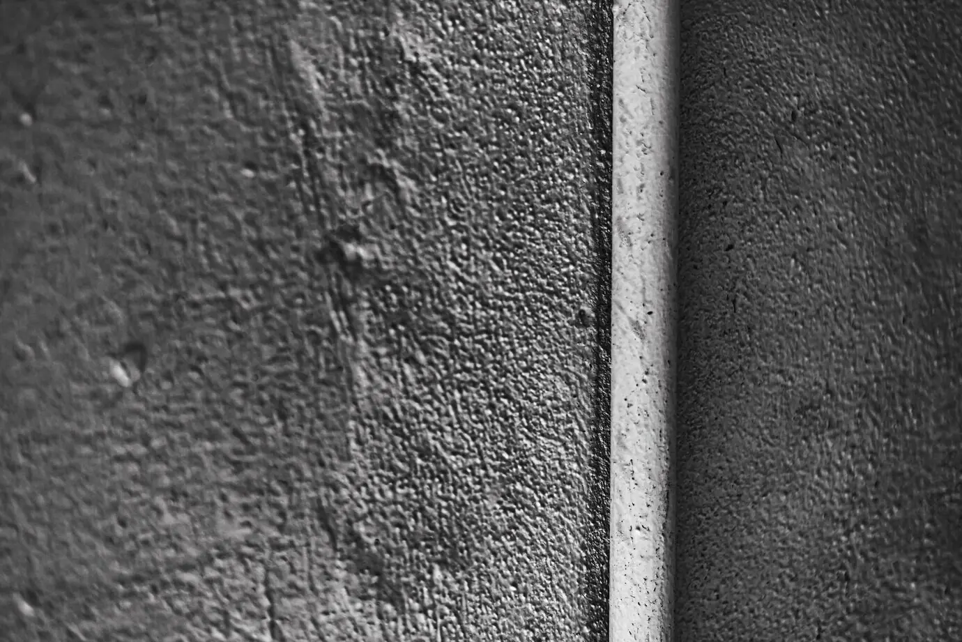
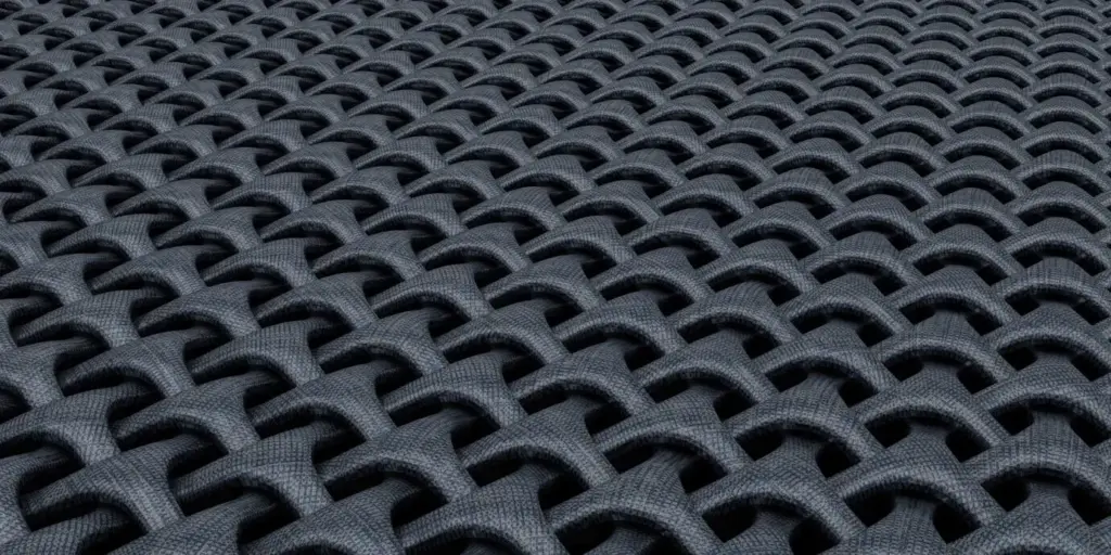
Sketch a grayscale map first. Decide where the darkest and lightest areas belong, then translate those values into muted hues. Because value differences are more legible than hue changes, readability stays intact. This approach ensures subtle colors still lead users effectively, whether in a hallway, on packaging, or across a mobile interface with varying ambient conditions.